
UX/UI Designer
PURE VISION
PURE VISION
Comprehensive design system and brand identity for an EdTech startup from typography scales and color tokens to icon sets, UI components, and responsive web layouts. Building a scalable design language from zero.
Comprehensive design system and brand identity for an EdTech startup from typography scales and color tokens to icon sets, UI components, and responsive web layouts. Building a scalable design language from zero.
Year
2020
Year
2020
Year
2020
Client
Client Project
Client
Client Project
Client
Client Project
Industry
EdTech
Industry
EdTech
Industry
EdTech
Project Duration
3 months
Project Duration
3 months
Project Duration
3 months
The Problem
Pure Vision Learning, an EdTech startup, needed a unified visual identity and design system to ensure consistency across their growing product suite. Without established guidelines, each new feature introduced visual debt and brand fragmentation.

Brand & System Foundation
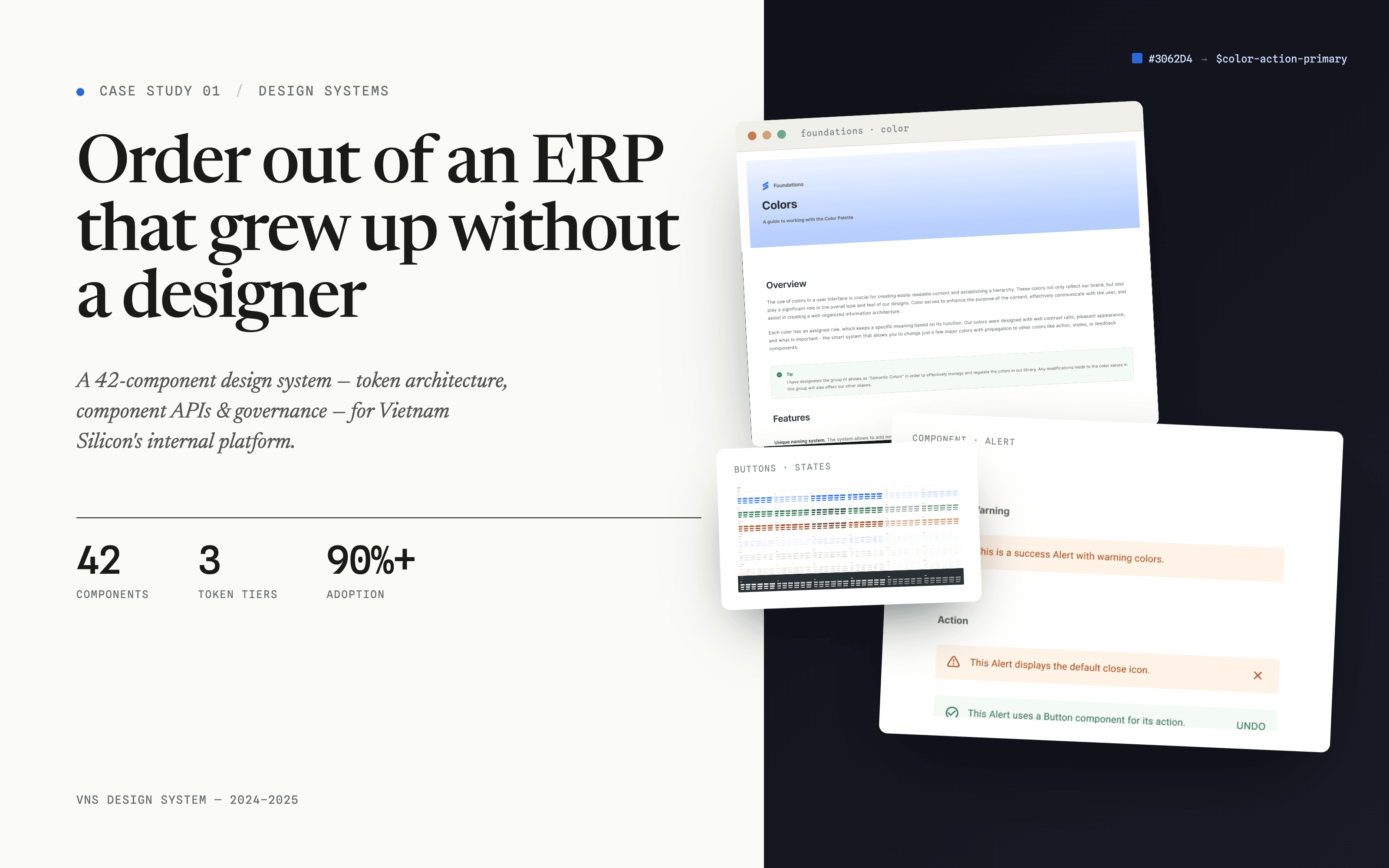
Selected TeX Gyre Adventor as the primary typeface, a geometric sans-serif conveying approachability and intellectual rigor. Built a complete type scale (H1–H5) with defined line heights and responsive adjustments. Designed a dual-layer color system: brand colors for identity touchpoints, UI colors with programmatic tint/shade scales for interface use. Each color includes accessibility-tested contrast ratios. Created 3 icon set variants (outlined, filled, illustrated) for different contexts.


Component Library & Application
Built a component library covering core UI patterns: form elements, buttons (primary, secondary, ghost with size and state variants), alerts and notifications, pagination, cards and content containers. Extended the design system into brand collateral: business cards, letterheads, brochures, and email signatures. Applied the system to responsive web pages including the home page and event listing pages.

Outcome
Delivered a comprehensive design system serving as the single source of truth for Pure Vision Learning’s product and marketing teams. The system reduced design-to-development handoff friction and eliminated visual inconsistencies across features. This project demonstrates end-to-end design system architecture from brand strategy through token definition to component library and real-world application.
MORE
Latest Projects


UX/UI Designer
PURE VISION
PURE VISION
Comprehensive design system and brand identity for an EdTech startup from typography scales and color tokens to icon sets, UI components, and responsive web layouts. Building a scalable design language from zero.
Comprehensive design system and brand identity for an EdTech startup from typography scales and color tokens to icon sets, UI components, and responsive web layouts. Building a scalable design language from zero.
Year
2020
Year
2020
Year
2020
Client
Client Project
Client
Client Project
Client
Client Project
Industry
EdTech
Industry
EdTech
Industry
EdTech
Project Duration
3 months
Project Duration
3 months
Project Duration
3 months
The Problem
Pure Vision Learning, an EdTech startup, needed a unified visual identity and design system to ensure consistency across their growing product suite. Without established guidelines, each new feature introduced visual debt and brand fragmentation.
Brand & System Foundation
Selected TeX Gyre Adventor as the primary typeface, a geometric sans-serif conveying approachability and intellectual rigor. Built a complete type scale (H1–H5) with defined line heights and responsive adjustments. Designed a dual-layer color system: brand colors for identity touchpoints, UI colors with programmatic tint/shade scales for interface use. Each color includes accessibility-tested contrast ratios. Created 3 icon set variants (outlined, filled, illustrated) for different contexts.
Component Library & Application
Built a component library covering core UI patterns: form elements, buttons (primary, secondary, ghost with size and state variants), alerts and notifications, pagination, cards and content containers. Extended the design system into brand collateral: business cards, letterheads, brochures, and email signatures. Applied the system to responsive web pages including the home page and event listing pages.
Outcome
Delivered a comprehensive design system serving as the single source of truth for Pure Vision Learning’s product and marketing teams. The system reduced design-to-development handoff friction and eliminated visual inconsistencies across features. This project demonstrates end-to-end design system architecture from brand strategy through token definition to component library and real-world application.
MORE
Latest Projects
UX/UI Designer
PURE VISION
PURE VISION
Comprehensive design system and brand identity for an EdTech startup from typography scales and color tokens to icon sets, UI components, and responsive web layouts. Building a scalable design language from zero.
Comprehensive design system and brand identity for an EdTech startup from typography scales and color tokens to icon sets, UI components, and responsive web layouts. Building a scalable design language from zero.
Year
2020
Year
2020
Year
2020
Client
Client Project
Client
Client Project
Client
Client Project
Industry
EdTech
Industry
EdTech
Industry
EdTech
Project Duration
3 months
Project Duration
3 months
Project Duration
3 months
The Problem
Pure Vision Learning, an EdTech startup, needed a unified visual identity and design system to ensure consistency across their growing product suite. Without established guidelines, each new feature introduced visual debt and brand fragmentation.
Brand & System Foundation
Selected TeX Gyre Adventor as the primary typeface, a geometric sans-serif conveying approachability and intellectual rigor. Built a complete type scale (H1–H5) with defined line heights and responsive adjustments. Designed a dual-layer color system: brand colors for identity touchpoints, UI colors with programmatic tint/shade scales for interface use. Each color includes accessibility-tested contrast ratios. Created 3 icon set variants (outlined, filled, illustrated) for different contexts.
Component Library & Application
Built a component library covering core UI patterns: form elements, buttons (primary, secondary, ghost with size and state variants), alerts and notifications, pagination, cards and content containers. Extended the design system into brand collateral: business cards, letterheads, brochures, and email signatures. Applied the system to responsive web pages including the home page and event listing pages.
Outcome
Delivered a comprehensive design system serving as the single source of truth for Pure Vision Learning’s product and marketing teams. The system reduced design-to-development handoff friction and eliminated visual inconsistencies across features. This project demonstrates end-to-end design system architecture from brand strategy through token definition to component library and real-world application.
MORE