
UX/UI Designer
SOULLINK DS
SOULLINK DS
Token-based design system built from scratch color semantic layers, modular typography scale, spacing system, and a full component library with variant & state management.
Token-based design system built from scratch color semantic layers, modular typography scale, spacing system, and a full component library with variant & state management.
Year
2024
Year
2024
Year
2024
Client
Freelance Project
Client
Freelance Project
Client
Freelance Project
Industry
Social / Dating
Industry
Social / Dating
Industry
Social / Dating
Project Duration
Ongoing
Project Duration
Ongoing
Project Duration
Ongoing
Context
SoulLink needed a design system built from scratch. As the sole designer, I defined the full token architecture, component structure, and variant logic, creating a foundation that could scale from MVP to team collaboration.

Token Architecture
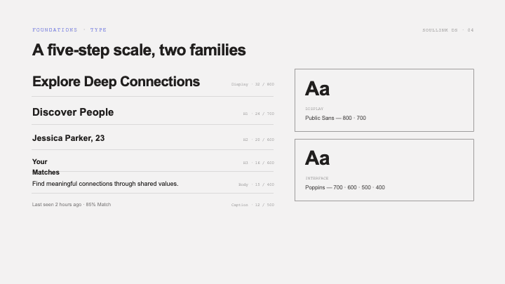
Three-layer color system: palette → semantic → component tokens, with dark-first approach. Modular typography scale (12–30px) with consistent line-height ratios. 4px base grid spacing system with named increments for predictable layouts.

Component Library
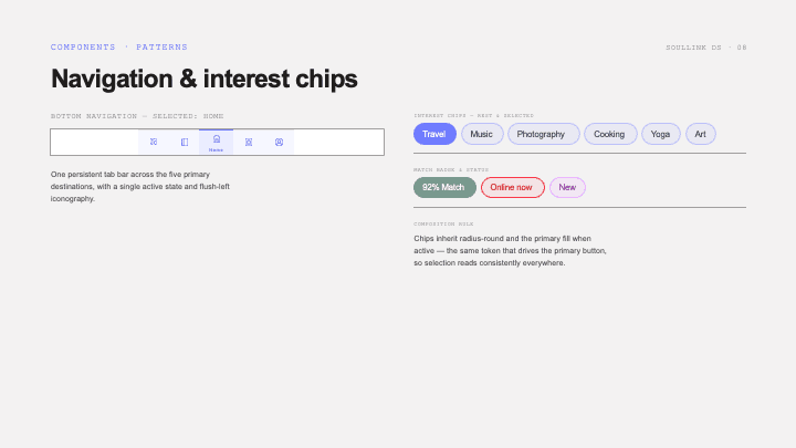
Atoms: buttons (3 types × 4 sizes × 2 states), inputs, icons. Molecules: cards, forms, navigation bars. Organisms: onboarding flows, feed layouts, chat interfaces. Every component documented with all interactive states.
Outcome
The system enabled rapid screen production, with new screens assembled from existing components in hours, not days. Architecture structured for team scaling with clear naming conventions, variant logic, and documentation.
Latest Projects


UX/UI Designer
SOULLINK DS
SOULLINK DS
Token-based design system built from scratch color semantic layers, modular typography scale, spacing system, and a full component library with variant & state management.
Token-based design system built from scratch color semantic layers, modular typography scale, spacing system, and a full component library with variant & state management.
Year
2024
Year
2024
Year
2024
Client
Freelance Project
Client
Freelance Project
Client
Freelance Project
Industry
Social / Dating
Industry
Social / Dating
Industry
Social / Dating
Project Duration
Ongoing
Project Duration
Ongoing
Project Duration
Ongoing
Context
SoulLink needed a design system built from scratch. As the sole designer, I defined the full token architecture, component structure, and variant logic, creating a foundation that could scale from MVP to team collaboration.
Token Architecture
Three-layer color system: palette → semantic → component tokens, with dark-first approach. Modular typography scale (12–30px) with consistent line-height ratios. 4px base grid spacing system with named increments for predictable layouts.
Component Library
Atoms: buttons (3 types × 4 sizes × 2 states), inputs, icons. Molecules: cards, forms, navigation bars. Organisms: onboarding flows, feed layouts, chat interfaces. Every component documented with all interactive states.
Outcome
The system enabled rapid screen production, with new screens assembled from existing components in hours, not days. Architecture structured for team scaling with clear naming conventions, variant logic, and documentation.
Latest Projects
UX/UI Designer
SOULLINK DS
SOULLINK DS
Token-based design system built from scratch color semantic layers, modular typography scale, spacing system, and a full component library with variant & state management.
Token-based design system built from scratch color semantic layers, modular typography scale, spacing system, and a full component library with variant & state management.
Year
2024
Year
2024
Year
2024
Client
Freelance Project
Client
Freelance Project
Client
Freelance Project
Industry
Social / Dating
Industry
Social / Dating
Industry
Social / Dating
Project Duration
Ongoing
Project Duration
Ongoing
Project Duration
Ongoing
Context
SoulLink needed a design system built from scratch. As the sole designer, I defined the full token architecture, component structure, and variant logic, creating a foundation that could scale from MVP to team collaboration.
Token Architecture
Three-layer color system: palette → semantic → component tokens, with dark-first approach. Modular typography scale (12–30px) with consistent line-height ratios. 4px base grid spacing system with named increments for predictable layouts.
Component Library
Atoms: buttons (3 types × 4 sizes × 2 states), inputs, icons. Molecules: cards, forms, navigation bars. Organisms: onboarding flows, feed layouts, chat interfaces. Every component documented with all interactive states.
Outcome
The system enabled rapid screen production, with new screens assembled from existing components in hours, not days. Architecture structured for team scaling with clear naming conventions, variant logic, and documentation.